A Refresh Built to Stand Out
STOCKWELL ENGINEERS
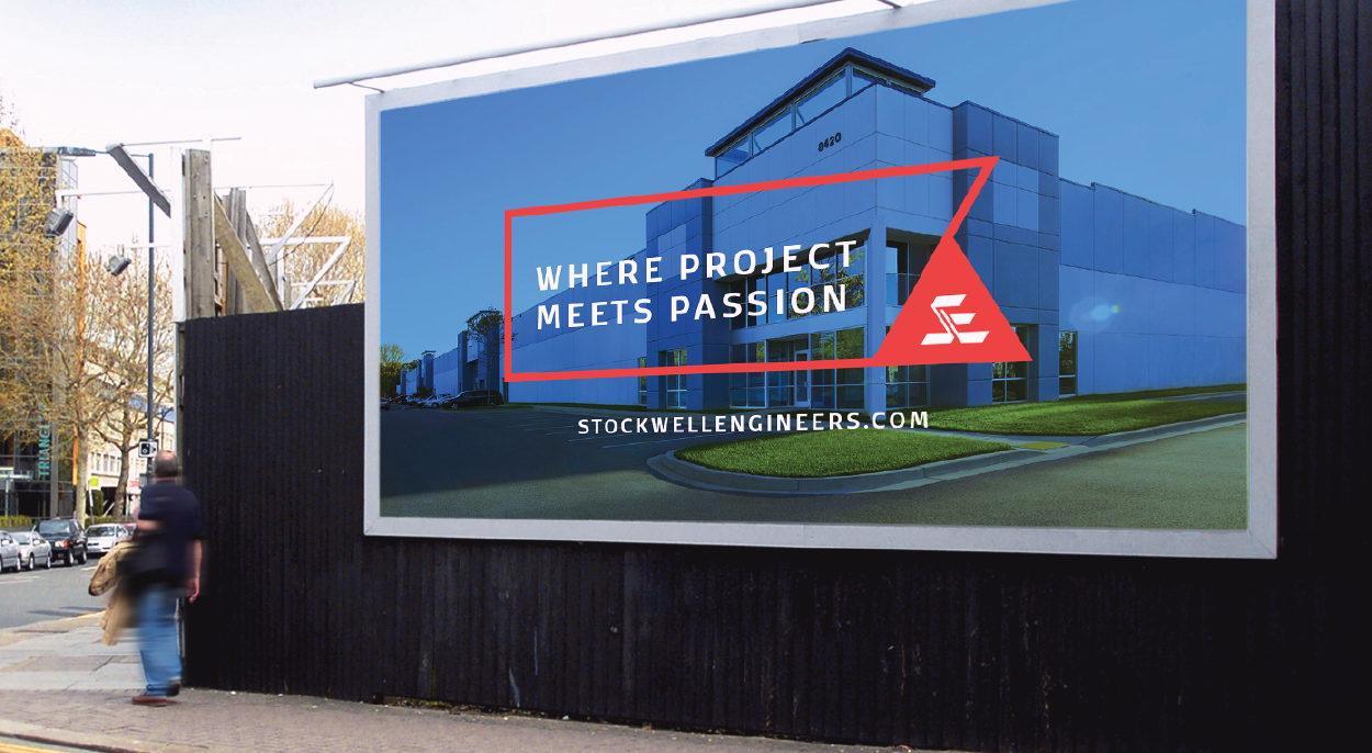
Stockwell Engineers, a longstanding engineering firm based in Sioux Falls, was in need of a brand refresh in order to stand out and differentiate themselves from their competition. After research and discovery with the Stockwell team, we learned that they were looking for a new way to express the design aspect of their business and the artful approach they take to each project. Another main focus would be promoting the extensive list of services they offer under one roof, which is uncommon for most engineering firms.
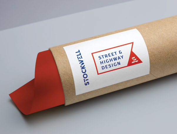
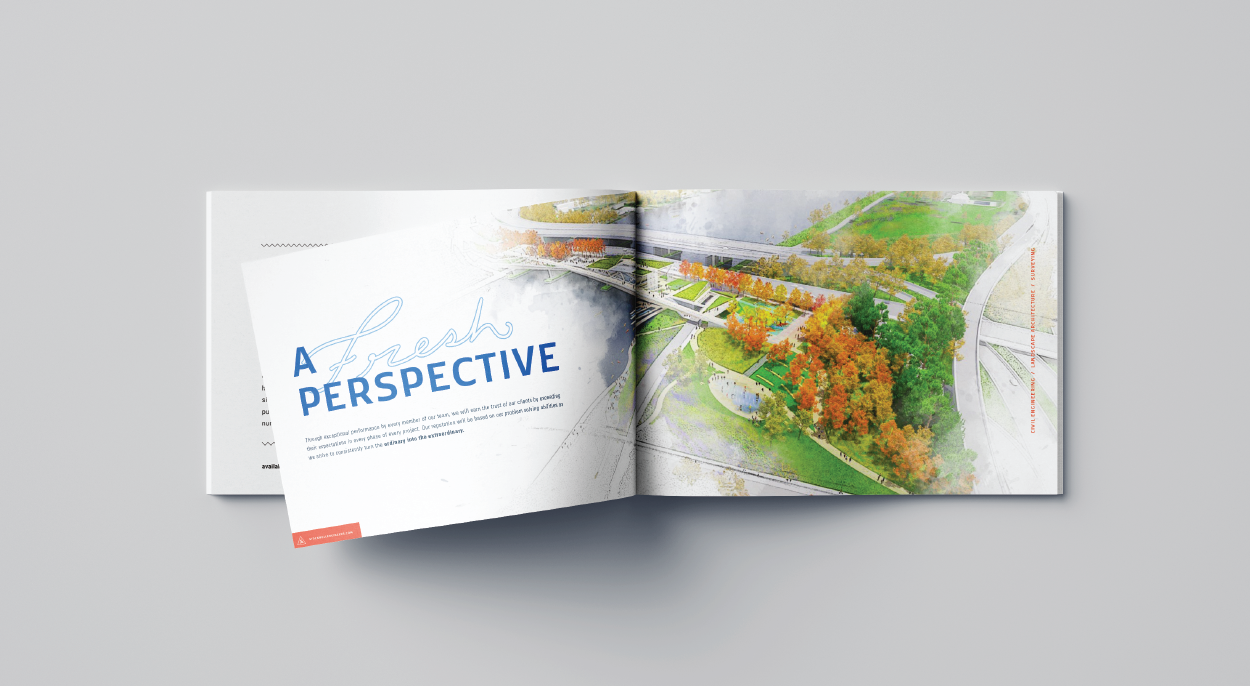
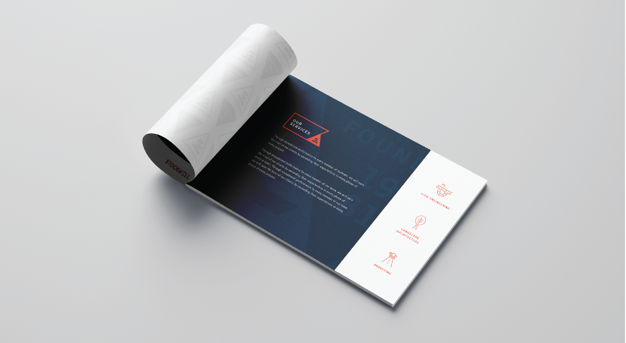
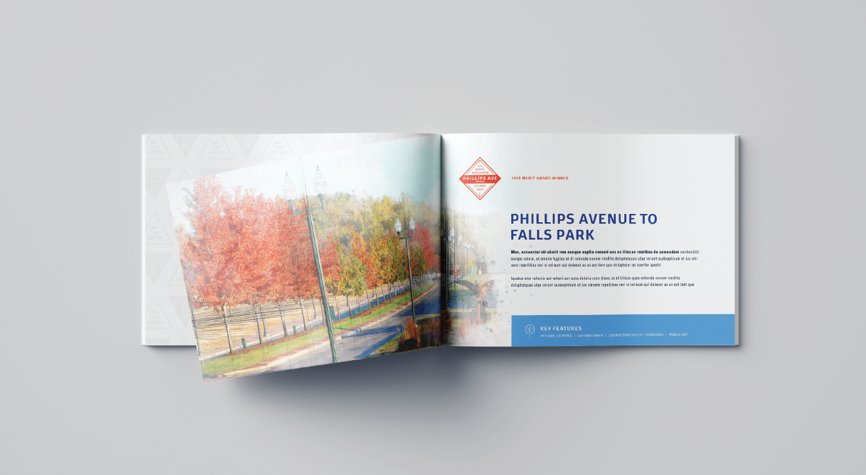
Keeping their current logo and icon intact, Caliber designed a new system of graphic elements and layouts for the Stockwell brand. The current icon was re-imagined into a stand alone mark, set in a triangle shape to promote the strength and stability of their work. The color orange, often associated with creativity and enthusiasm, was added as an accent color to bring new life to the existing color palette. A set of icons and award badges were designed to visually show their services and promote project awards.

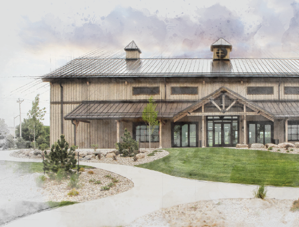
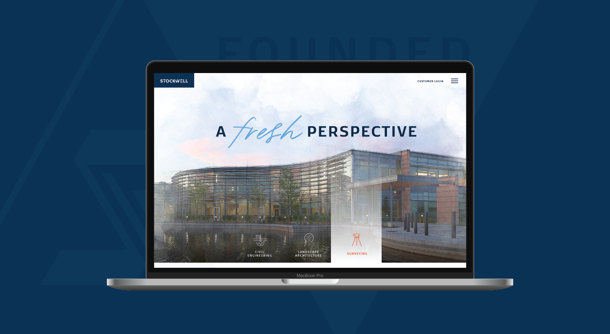
Promoting the design aspect of their services was shown through an image treatment of architectural lines and a watercolor effect. This treatment was used on select images throughout their website and featured prominent projects Stockwell has completed.
This fresh look has given Stockwell a new way to promote themselves and their business, and also reflect on the projects they have created and the fun culture their company offers.

