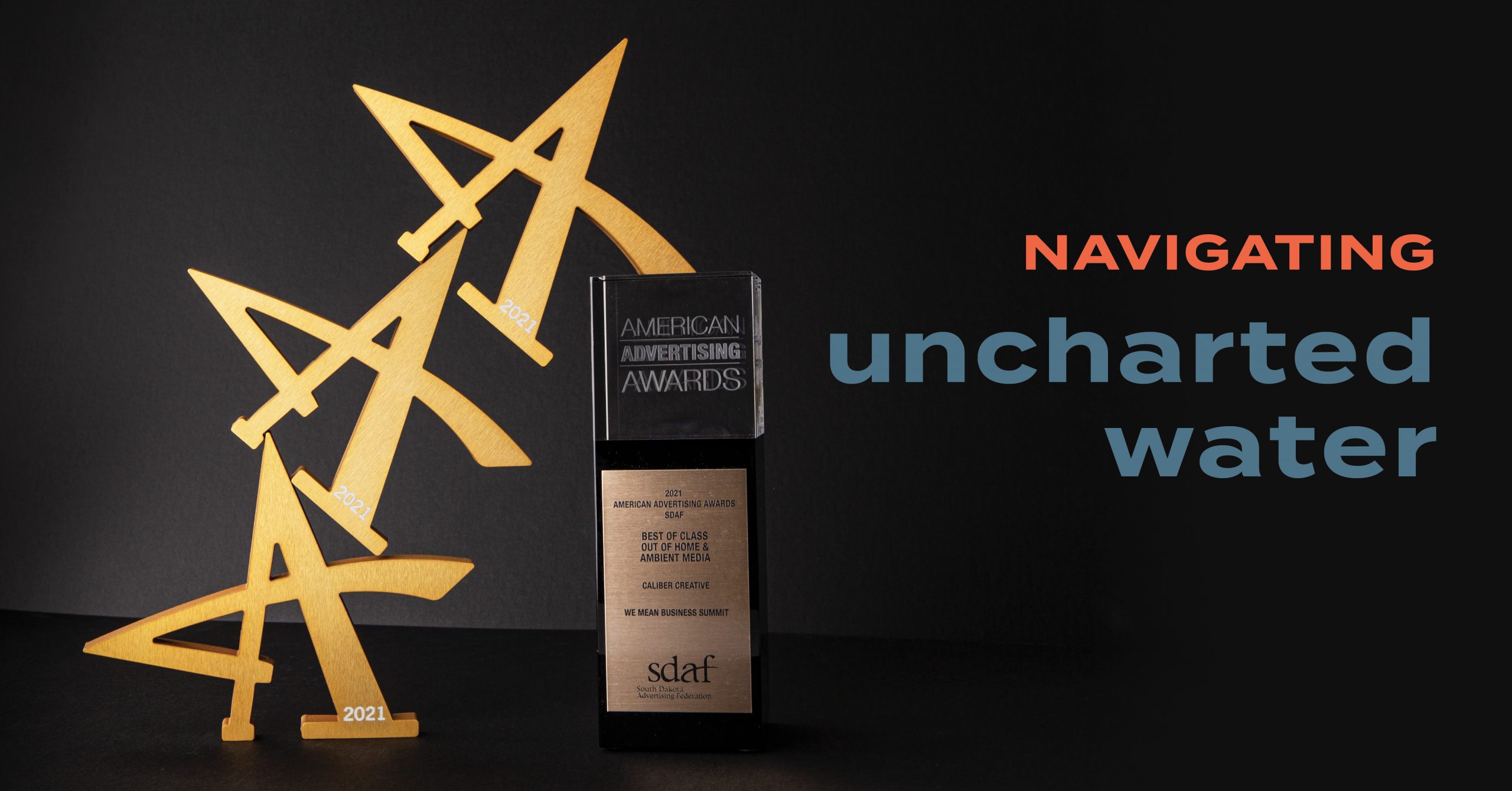
Navigating Uncharted Water Leads To Gold
By Casey Schultz on Mar 12, 2021
Everything in business, as in life, is judged by others for better or worse. My point is that attention to detail and quality go hand in hand. In the advertising world, one lapse in judgement or careless oversight can send even the most thought through concepts into the sea of scrutiny. Arrr and the scrutiny sea is no place to be, yarrr (ha that rhymed and hopefully you read that in the pirate voice). Perfect ads have been ruined by misspellings, and photoshop has caused its fair share of extra limbs and questionable edits to show up in finished products.
Recently Caliber, along with our other South Dakota competitors, set out to see who could sail this sea the best. For all involved there were no misspellings or extra limbs that were put forth for judgement (at least that I’m aware of). The American Advertising Awards (a.k.a., AAAs) is the industry’s largest and most representative competition. This is an awesome event that typically has the pomp and culture of a red carpet party with some friendly banter and competition. This year, COVID took its toll and the event went virtual, but not all was lost. We were able to all join together and view the amazing work that each agency created in their own right.
Caliber was fortunate and won five individual awards and a Best of Class award for our work over this past year. Details, descriptions and links to the full work of each below:
Best of Class – Out of Home & Ambient Media | Gold AAA
LG Seeds – We Mean Business Summit
The 2020 We Mean Business Summit was an inaugural event for LG Seeds, which was created for their top dealers. The event was unique as it put a focus on helping these dealers improve and grow their businesses, rather than focusing on the LG brand. With that said, they wanted to change the way they interacted with their dealers and needed this event to bring the wow factor, to feel exclusive and stand out from all prior events that LG dealers are required to attend.
Integrated Brand Identity Campaign | Gold AAA
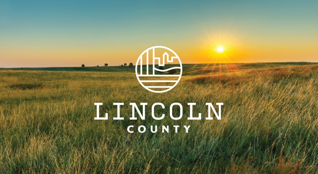
Lincoln County – Lincoln County Rebrand
Lincoln County of South Dakota was in need of an identity and logo update. They felt the need to modernize the county’s image and branding, and also differentiate themselves from the many other Lincoln Counties in the US. We worked with the Lincoln County team to create an identity that would truly reflect the county and the residents that live there. A strong symbol was created that equally represented the urban and rural population, as well as the landscape of the county.
Integrated Ad Campaign | Gold AAA
LG Seeds – Mix Matters Campaign
Mix Matters is a multifaceted campaign aimed at explaining a personalized agronomic approach that is new to the market. It encompasses two sets of product lines and an app that supports the approach. Our marketing efforts included multiple digital touch points, app design, promotional videos, radio spots, product illustrations and copywriting. Our goal was to drive app downloads as we increased awareness and curiosity. To achieve our goal we highlighted the benefits that accompanied the personalized agronomic approach. The campaign creative focused on farmers and the work that they do each day to provide, succeed and endure the ups and downs of the farming business.
Corporate Social Responsibility Campaign | Silver AAA
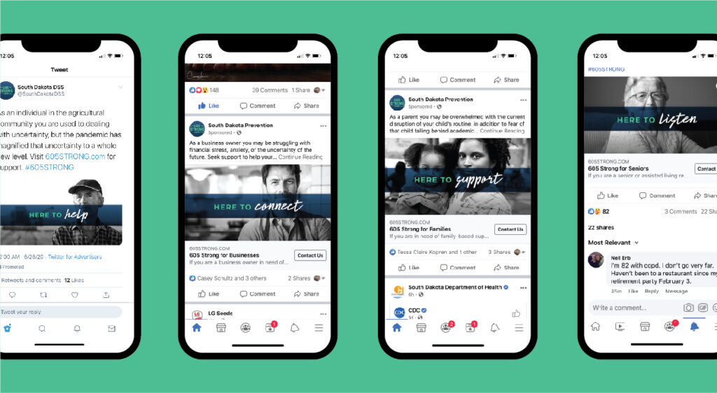
Helpline Center – 605 Strong Campaign
The 605 Strong campaign was a part of a large initiative to provide resources, support and help to South Dakotans who have been affected by the pandemic. The overall graphic theme was based on several different target audiences, including farmers, business owners, families with young children, elderly, hispanics, healthcare workers and COVID-19 survivors. Our call to action was to encourage those affected to reach out and call 211 to receive the support they might need.
Integrated Branded Content Campaign | Silver AAA
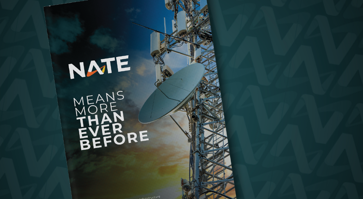
NATE – United by NATE Rebrand
NATE was looking for an update to their current brand in order to stay relevant and modernize the overall look and feel of their organization, formally known as the National Association of Tower Erectors. NATE is now the Communications Infrastructure Contractors Association and the new brand was developed with the future of the association in mind. It has an innovative, technology focused vibe. The custom shape in the form of an A in NATE represents high tech, communication and connectivity to provide the future focused feeling the association is embracing. We created a custom blue-green primary color, and brought in bright accent colors in using orange and yellow to represent safety, technology and connectivity.
On to next year
The scrutiny sea was good to us this year and to some others as well. Congratulations to all the other agencies that participated and the work that won awards. We look forward to creating more award winning work in 2021.
Cheers – JZ

