Top 5 Design Lessons Learned This Year – Creativity At Work (literally)
By Casey Schultz on Jul 26, 2018
We have had the opportunity to work on some really cool client work as well as some neat promotional projects for Caliber in the past year. I have selected the top 5 design lessons we’ve learned so far this year:
#5 Specialized finishes are a pain – but totally worth it.
Awesome textures and finishes don’t come easy, but are far from being in short supply with the variety of features and options to choose from. Gold foils, embossing, custom die cuts, specialty paper and metallic inks are just a couple techniques that were used in an branding identity system that we created for Plains Commerce Bank. Tailoring our options with the pristine client target demographic in mind was key and took this project from just okay to bomb.com. The specialty features we used hit the nail on the head and brought the overall look of the bank and their people, products and services to a new level.

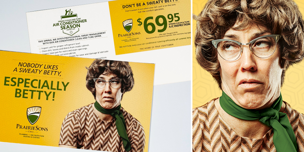
#4 Sweaty headlines don’t stink – great photos don’t either.
Recently, we had the opportunity to create a direct mail campaign for one of our clients known for witty headlines and over-the-top photography. This freedom to be clever and funny isn’t for everyone. But, when given the chance to grab that awkward picture with an ascot and use it on a print mailing, you go for it! The takeaway here is that sometimes strange is good and it can really leave an impact when used in the right applications (plus a good headline always helps). Don’t be a sweaty Betty – use non-traditional stuff when it makes sense.
P.S. Apologies in advance for anyone named Betty who reads this!

#3 A handshake in a logo, why not!
Sometimes when working with established brands the opportunity arises to improve upon what you’re given. In this case, one of our clients was in need of some branding and visual assistance. Through the initial stages of the project it became clear that the logo and overall look needed a bit of updating. However, change is a hard thing and with businesses that have distinct marks, as it was in this case, it becomes increasingly difficult. The main challenge with this brand refresh was how to keep the original look intact, while improving readability and creating a logo that could be applied to apparel and other applications. The handshake, being a core element, needed to be cleaned up and made a consistent weight. Visually, it needed to be similar to the original mark for the brand to remain recognizable. After the hands were locked in, the rest fell into place with a more modern color scheme and beefed up logotype. Moral of the story…when simplicity is applied to logos, it generally makes them better overall, or in this case, a better handshake!

#2 Clients shouldn’t get all the cool stuff all the time.
Internal creative has been a big focus the past couple of months with a new website on the horizon and some other fun side projects. The most rewarding and exciting things that happen on a daily basis sometimes are the random thoughts and projects that fill the work gaps. These also break up the day and offer up some freedom from constraints. Here are just a couple of quick shots showcasing some badges and personality-based items we have been crafting. More to come soon, so keep a keen eye on the Caliber site for further updates and more cool stuff!

#1 Be the one to do stuff for social causes – seriously.
Client work that furthers any social cause is rewarding in so many ways, seriously. With a large production crew and 20 plus student actors/talent, a recent suicide prevention campaign was a big undertaking in itself. As most of the student actors had seen or experienced the impact of suicide, this became personal to everyone involved. The professionalism of the young talent and the seriousness in which they approached the subject made this project all the more rewarding. The fact that this campaign has the ability to make a positive difference in even one individual suffering with the thought of suicide makes me proud. A big thanks needs to go out to every one of our vendors and talent that made this project possible!!

What lessons have you learned this year? Lessons are meant to be shared and learned from – they are necessary in finding ways to improve and innovate. Self evaluation is as valuable as it is difficult, but can often help you break through a funk or realize that you’re on the right path. Reach out if you or your business would like to discuss your current strategy and how we can help you connect with your target audience.
